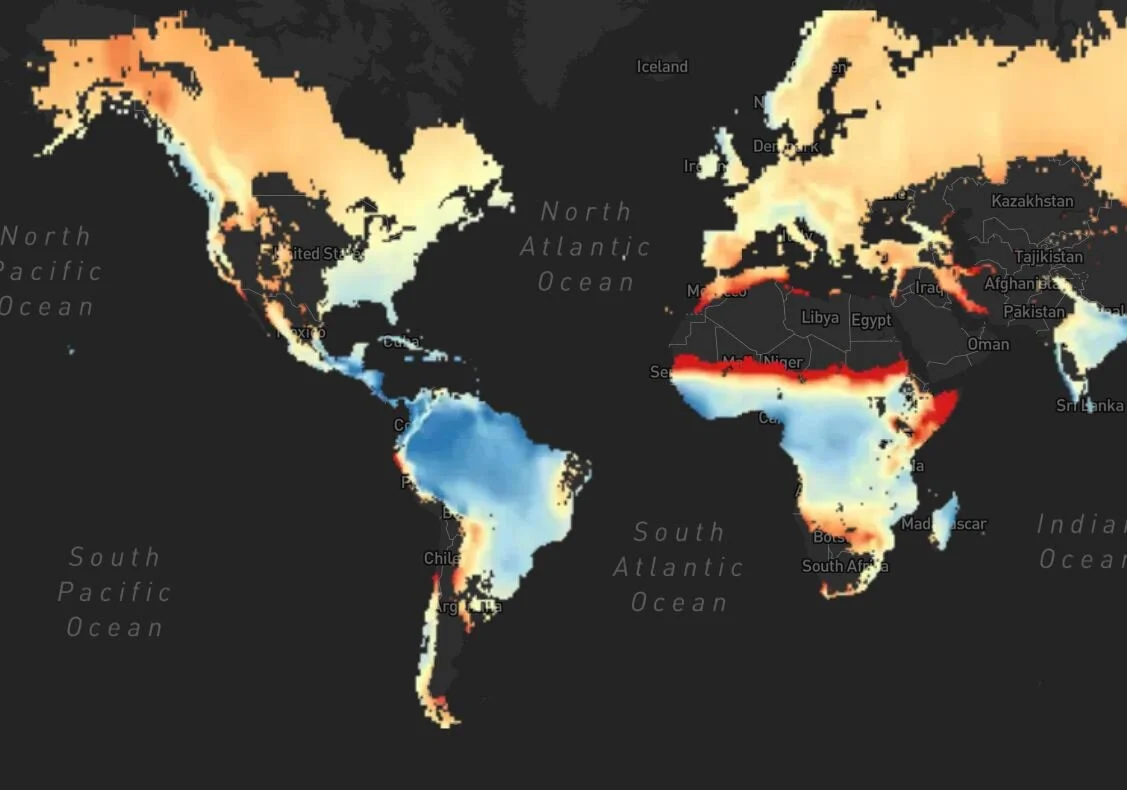
PIRE CREATE Visualization Tools
We are aware of the importance of understanding complex scientific data. Consequently, the PIRE CREATE project is developing easy-to-use visualization tools. These tools allow us to communicate and share our results in a non-scientific language with different interest groups, thus reaching a much wider audience.
These tools include intuitive and interactive maps that allow the user to visualize, explore, interact and download the data that scientists use to tackle specific problems related to climate change.
These maps are a new way of telling our data’s story, thereby communicating science in a manner that is both fascinating and easy to understand.
Transforming data into actionable information
Our results will further provide input for data visualization and creation of products that can help inform governmental agencies and decision makers about future risks associated with climate projections.
Visualizing the results from the PIRE-CREATE research through interactive maps helps us to reach non-scientific audiences to better comprehend and act upon the risks associated with future climate change.
The PIRE CREATE project has designed three visualizations tools to be shared with the general public and policy makers, but also among other interested scientists:
Tree Ring Viewer:
This PIRE CREATE visualization tool provides unique access to the tree-ring archive hosted by the National Oceanic and Atmospheric Administration (NOAA), via an interactive mapping and visualization platform for the scientific community, policy-makers and public at large. The visualization platform allows powerful insights to help government and public officials learn more about the future risks associated with climate change around the world.
Forest Stress Viewer:
Researchers at the University at Albany’s Department of Atmospheric and Environmental Sciences (DAES) have turned to more than a century’s worth of data (from 1901 to 2012) from NOAA’s International Tree Ring Data Bank to analyze historical tree growth at 3,579 forests around the world. With this new Forest Stress Viewer tool the user can analyze both past and future projections (from 2045 to 2060) of forest stress around the world. The Forest Stress visualization platform depicts this data on an unprecedented, global scale.
PHYDA Climate Globe
This Paleo Hydrodynamics Data Assimilation product (PHYDA) visualization tool maps 2,000 years of reconstructed temperature and hydroclimate onto a global interface. This innovative transformation optimizes exploration of an expansive database into an approachable web-based visualization platform for streamlined presentation, customized data download options and interactive collaboration.
Resources:
During this webinar we are going to learn how we can use visualization tools to communicate science to different audiences focusing on policy makers.
Graphical representations help convey complex concepts in a succinct and accessible manner.
Learn how the PIRE team is using visualization tools to communicate science. Come away with the skills you need to provide actionable information for policy-makers.


